
Nosto’s Personalized Email widget is a powerful tool for those who need to lean on an ESP (Email Service Provider) for marketing’s segmentation reasons but yet want to implement some bespoke personalized recommendation to make the final result even more tailor made for the end user – or, you name it, who is going to receive the email.
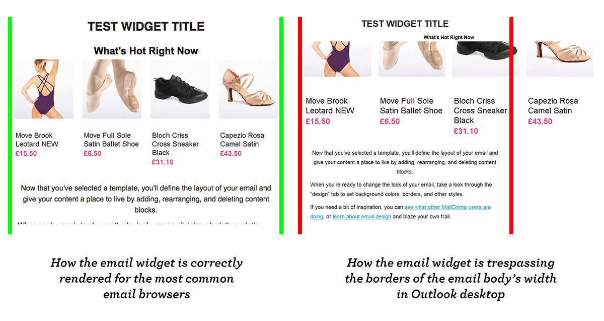
The Personalized Email widget is a snippet of HTML and CSS code which can be copied/pasted onto your email’s body: it is a one-size-fits-all and has been cross-browser tested but, for this or that reason (mostly due to the images’ sizes), it may glitch on the desktop version of Outlook Express. Here you can see how to trick this problem and make the email widget works across all the known and most used platforms.
WHY IS THIS HAPPENING?
The email widget is none other than a HTML table with 8 images in it: 4 images for the products’ pictures and 4 images for the products’ info (yes, names and prices are actually images). On each image, besides others, two CSS properties are inlined: width: auto; and max-width: 130px;. Outlook (as also IE) cannot read the max-width property when this is applied on an image grafted in a table and this will make each image to expand itself for its whole natural width, making the widget (so the table) to trespass the width of the email body.
TROUBLESHOOTING
In this case everything you have to do would be to edit the inline CSS for each image (in total: 8) and to replace the width: auto; with width: 130px; (where 130px is a faked number just for the purpose of this example). Usually ESPs provide email templates which are 600px wide, in order to make them flawlessly fit the most common email browsers: if this is your case, a 130px width for the image will render a very good final result because this means that it will leave a margin between the images so that they will not be sticked one to the other. For the record, since that we are dealing with tables and cells, once you have fixed the width for the images, the margin between them will be automatically calculated by the browser.

In the red rectangle, the width has to be specified without “px” as it is an attribute, whilst you have to set “px” for the width in the blue rectangle as it is a property
TIPS&TRICKS
The Internet is a vaste and big pond, with clear and precise rules. You can’t use this and not use that in this or that case, so you better be aware of which rules you are about to infringe. caniuse.com provides you a powerful tool to check which property can be used on determined browsers and on which others it will not properly work.
