
This article covers only dedicated mobile sites. In case your site uses responsive web-design, read article here.
Nosto can be used across a regular website and also on a mobile site version by leveraging data from the main website, which in most cases receive more visits and data than a dedicated mobile site. Collecting data from both sites and customer touch points, improves the impact and relevancy of recommendations, simply because Nosto has more data to process.
If this is not desired, both sites can be operated and managed separately, but in this case mobile and regular site both need separate Nosto accountIDs. Basically this means that from Nosto’s perspective, sites are dedicated environments and don’t have any relationship with each other.
In the article we use company.com as an example of the full-screen site and m.company.com for mobile and introduce how to implement Nosto on both site using just one Nosto account. As a premise, Nosto expects that the product url structure is similar between site versions.
Data Exchange On a Mobile Site
The tagging of product pages on a mobile site needs to be set similarly to regular site and both sites need to use the same Nosto accountID. For example if a product’s url mapped to Nosto in the implementation on a regular site is:
http://company.com/category/subcategory/product-acme-1
The tagging of the product url and image url on a mobile site needs to be done similarly, even though the actual url-address would be:
http://m.company.com/category/subcategory/product-acme-1
Effectively, Nosto then treats page loads and views similarly and doesn’t make a difference between a page load between regular site and mobile.
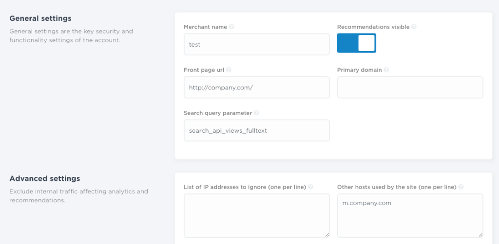
Configuring Account Settings
Next, include the mobile site’s domain under account settings as an accepted hostname or by using primary domain settings. Both will do the trick in the example and Nosto will process data sent by both sites. If not set accordingly, Nosto will process data only from the regular site and ignore data sent by the mobile-version, in the example: m.company.com
Configuring Recommendation Slots
The mobile site requires separate recommendation slots applied on the mobile pages, which allow using separate recommendation templates (design) for the mobile site version. This also makes possible to use a separate recommendation setup on the mobile site as smaller screen size probably won’t allow as extensive use of product recommendation as full-screen size.
Configuring Recommendation Templates
Mobile site obviously uses different design than the regular site. Design the recommendation to fit the mobile design normally and on the contrary, design templates for the regular version according to your design standards.
The only trick is to tweak the product url in the recommendation templates that are applied for recommendations populated in the mobile version, which will keep the visitor in the mobile site, when they click a recommendation.
By default, using variable
$!product.url
will output an url that refers to regular site i.e. the output url would be
http://company.com/category/subcategory/product-acme-1
This would result customers jumping to from a mobile site to a regular site, when they click recommendations.
Using Trim To Add a Subdomain-referrer
As referred above:
$!product.url
is the Object containing the shop URL
Since we only have this to use to create the links, in the example trim “www” out and replace it with “m” for mobile. it should be transformed in a string. So we will set a new variable (that we will call $linkUrl) containing our URL converted to string
#set( $linkUrl = $!product.url.toString())
then we will set another variable in which we will replace (taking the string we just converted) what we want to
#set($mobileLinkUrl = $linkUrl.replace("www","m"))In the function replace the first parameter is the piece to search in the string (here is “www”) and the other one will be what we replace (“m” in the example)
Now, supposing that our $!product.url is “http://www.company.com“, after the function
$!mobileLinkUrl
returns value suitable for mobile sites, in the example “http://m.company.com“.
For advanced users, example above could also be embedded in the same row by chaining one function after the other like here
#set( $mobileLinkUrl = $!product.url.toString().replace("www","m"))After trimming the url-links, customers will stay on the mobile site version when they click recommendations. As a final step, simply make sure that all the recommendation slots on the mobile site use templates designed especially for mobile.